Discover The Best JavaScript Datepicker Plugins and Libraries To Make Your App User-Friendly! It is no secret that creating a web application with a user-friendly, interactive, and intuitive interface is one of the biggest challenges faced by developers today. Many web applications are currently missing the ability to allow users to easily pick a date from a calendar-style interface. As a result, users have to manually enter dates and this can lead to errors and frustration.
Are you looking for a reliable and easy-to-use JavaScript Datepicker Plugin for your web application? Are you struggling to choose the best one for your project? Do you want to add a feature to your web application allowing users to easily pick a date? Fortunately, there is a wide variety of JavaScript Datepicker Plugins and Libraries available to help solve these problems. By taking advantage of these plugins and libraries, developers can easily add a feature to their web applications allowing users to pick a date quickly and accurately. Incorporating such plugins into business software enhances user experience and interaction, making it a valuable addition to web applications designed for business environments.
Therefore, we have prepared an extensive guide for you, and it’s not just a list of popular libraries. In this article, we will cover datepicker types, the advantages, and disadvantages of each, guides on how to choose them, and develop your solution.
Some of them are very simple and easy to code, while some offer users advanced options to customize according to their preferences. Nearly all of these datepickers are quite similar to each other, all having similar customizing options for enhancing the user experience.
Datepicker types
Designing a datepicker looks easy at first. Picking a date is often a painful experience. Bad examples can be found all around the web. This complexity underscores the necessity of integrating intuitive design in business software to facilitate user interactions and enhance the overall user experience.
We believe that to design a good experience, it’s important not to jump to conclusions too soon. Take time to ask questions, find answers, create user stories, and explore the web.

Let’s see the common date input patterns that help us identify the right datepicker for us.
Text input. The simplest way is to let the user simply type the date in. This always works if the proper validation is provided. It can be used together with the calendar datepicker.
Dropdown to choose each value: date, month, year. It can become frustrating, especially if the user needs to input time as well.
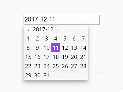
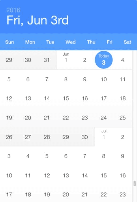
Calendar. The most frequent way to choose a date range. Multiple examples can be found online.
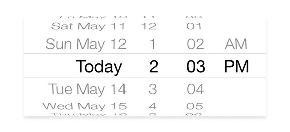
Scrolling datepicker on mobile devices. Works nicely if the user does not have to scroll too far into the past/future.
What makes the datepicker good
As with any digital product used for developing software, datepicker should also be assessed. Among them, there are both very good solutions suitable for serious decisions and fairly simple amateur solutions. We divided our evaluation criteria into 4 blocks.
Documentation. It is vital for whatever you’re using to be well-documented to learn how to build or reconstruct it.
Customization. A great library should come with options that can be updated to add or remove certain functionality.
Compatibility. Who wants to visit a site with a datepicker that only works in recent versions of Chrome and Webkit browsers?
UX. Ask yourself whether the plugin will be convenient for the needs of your user. Does it fit your product style? This is one of the most important criteria for evaluating datepicker libraries. The looks and quality of the docs are not that important, compared to how the library will deal with your task.
How to Pick the Right <datepicker>
Before you start choosing a datepicker, you should ask a few general questions about how your potential customers will use your solution. After that, you need to ask special questions about the tool itself. We have divided these questions into 2 blocks and prepared them for you.
General use case questions for choosing datepicker
What is the use case?
“Device performance analysis”
Who will be the user?
“Technical manager”
User’s main goal?
“Analyze device performance and detect performance degradation over time”
What kind of date picker would help users move forward in completing their tasks seamlessly?
“Text input with the calendar”
Special questions for selecting the right datepicker
- Do we need a datepicker, a date-range picker, or a time picker?
- Should the user be able to type in a date in the input field or only select predefined values using a date picker?
- Should the date picker contain default prepopulated values? If yes, what values should be the default?
- For date-range pickers on narrow screens, should the overlay automatically disappear once two dates are selected, or only when the user clicks on the “Continue” button to proceed?
- Should the week run from Monday to Sunday or from Sunday to Saturday?
- How to avoid displaying unavailable dates or zero-results dead ends?
While you keep in mind those questions, let’s see what we’ve prepared for you.
Top datepickers
We have cataloged the various React, Angular, and Bootstrap plugins that offer DateTime functionality. Some are more developed than others, each plugin has its own set of benefits. The best part about using open-source code is that it’s easy to customize for your purpose.
We only include those repositories that have more than 1k GitHub stars and divide the projects by technology.
React Datepicker
Airbnb react dates
GitHub stars: 11.8k
Price and License: MIT license
Website/Demo: http://airbnb.io/react-dates/
Github: https://github.com/airbnb/react-dates
Type: Date range with the calendar
Localization: moment.js
Accessibility: Keyboard support
Type of installation: npm
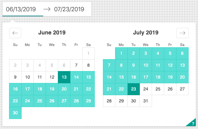
This is one of the best open-source React datepickers on the market. The design is clear and very intuitive. The library is well-documented and can be installed in several minutes through the npm.
A good plus from the point of usability is that the selected dates are highlighted in a separate color. So you can see your time interval.
The React datepicker is easily customizable. You can override styles with just two commands. With additional optional props, you can customize the look and feel of the inputs, calendar, etc. You can see what each of the props does in the live demo or explore how to wrap the pickers properly in the example folder. The library has a good localization.
This component is a good choice if you like React. The library is constantly updated and maintained by Airbnb – the datepicker is a key component of their site.
React-datepicker
GitHub stars: 6.5k
Price and License: MIT license
Website/Demo: https://reactdatepicker.com/
GitHub: https://github.com/Hacker0x01/react-datepicker
Type: Text input with the calendar
Localization: date-fn’s
Accessibility: Keyboard support
Type of installation: npm
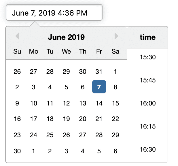
Another strong React datepicker. You only need to use a pair of npm commands to install it.
We liked a large number of components for customization. Based on this project, you can create almost any solution to select a date. There are options for time choice, text entry line, month choice, and date ranges.
The design is quite simple, that’s why this solution can be chosen for strict corporate applications. A good advantage of this project is date-fns library localization.
React-day-picker
GitHub stars: 4.5k
Price and License: MIT license
Website/Demo: http://react-day-picker.js.org/
Github: https://github.com/gpbl/react-day-picker
Type: Calendar
Localization: moment.js
Accessibility: –
Type of installation: npm
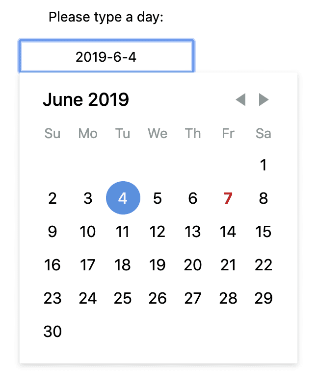
This project is simpler than the previous two. It is also installed with a couple of commands using NPM. Customization options are limited to only four variations. The design is also discreet and simple. Conclusion: if you need a quick, simple solution with no customization frills, then this is your option.
React-Widgets
GitHub stars: 2.3k
Price and License: MIT license
Website/Demo: http://jquense.github.io/react-widgets/api/DateTimePicker/
Github: https://github.com/jquense/react-widgets
Type: Text input with the calendar
Localization: moment.js, globalize.js
Accessibility: Keyboard support
Type of installation: npm
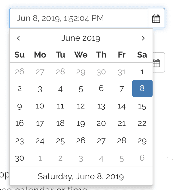
The product is part of other components. It means you can use it with other useful components such as a calendar, dropdown list, and others. The downside is that it is fairly simple and there is little opportunity for customization, because it is not the main component. An interesting feature is that this datepicker supports keyboard input, in contrast to more developed libraries.
Vue Datepicker
V-calendar
GitHub stars: 3.4k
Price and License: MIT license
Website/Demo: https://vcalendar.io/
Github: https://github.com/nathanreyes/v-calendar
Type: Calendar
Localization: a custom solution
Accessibility: –
Type of installation: npm
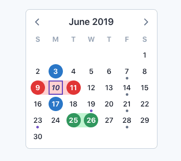
V-Calendar is a modern and flexible plugin for displaying simple, attributed calendars in Vue. It uses attributes to decorate the calendar with various visual indicators including highlighted date regions, dots, bars, content classes, and even popovers for simple tooltips or custom slot content.
Any of these indicators can be displayed for single dates, date ranges and even complex data patterns like the following:
- every other Friday,
- 15th of every month,
- last Friday of every other month.
This Vue datepicker includes a single date, multiple dates, and date range selection modes out of the box. Also, because V-date-picker is simply a wrapper for V-calendar, it supports the same props, slots, and custom theme support.
Vuejs-datepicker
GitHub stars: 2.6k
Price and License: MIT license
Website/Demo: https://codesandbox.io/s/mpklq49wp
GitHub: https://github.com/charliekassel/vuejs-datepicker
Type: Calendar date-picker
Localization: a custom solution
Accessibility: –
Type of installation: npm
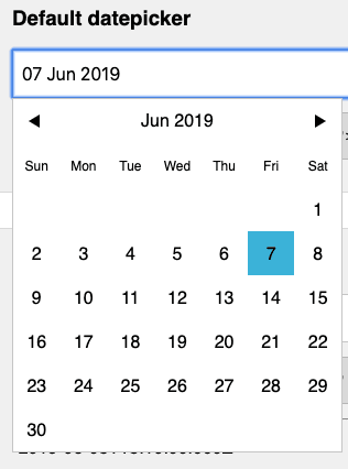
This vue datepicker is not very popular. It is installed in a few clicks and has good options for customization. With the help of this solution, you can make a date range picker, highlight the dates you need, and make slots for dates.
Bootstrap Datepicker
Bootstrap-datemepicker
GitHub stars: 7k
Price and License: MIT license
Website/Demo: http://eonasdan.github.io/bootstrap-datetimepicker/
GitHub: https://github.com/Eonasdan/bootstrap-datetimepicker
Type: text-input
Localization: moment.js
Accessibility: –
Type of installation: bower
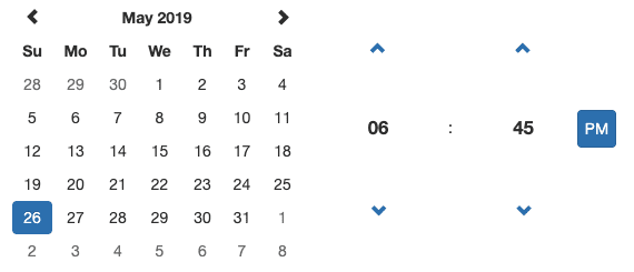
Anyone familiar with Bootstrap knows just how useful it is for new projects. If you design sites on Bootstrap a lot, keep this Bootstrap Datepicker saved.
It’s one of the few plugins made specifically for Bootstrap layouts, and it should be compatible with the Bootstrap 4 too.
The design includes a section for changing the month & year along with a time selector for altering minutes/hours in your bootstrap datepicker. It fits perfectly into the Bootstrap UI, so it’s certainly a good choice for anyone using Bootstrap.
Bootstrap-datepicker
GitHub stars: 12.5k
Price and License: Apache License 2.0
Website/Demo: https://uxsolutions.github.io/bootstrap-datepicker/
GitHub: https://github.com/uxsolutions/bootstrap-datepicker
Type: text-input
Localization: a custom solution
Accessibility: Keyboard support
Type of installation: yarn
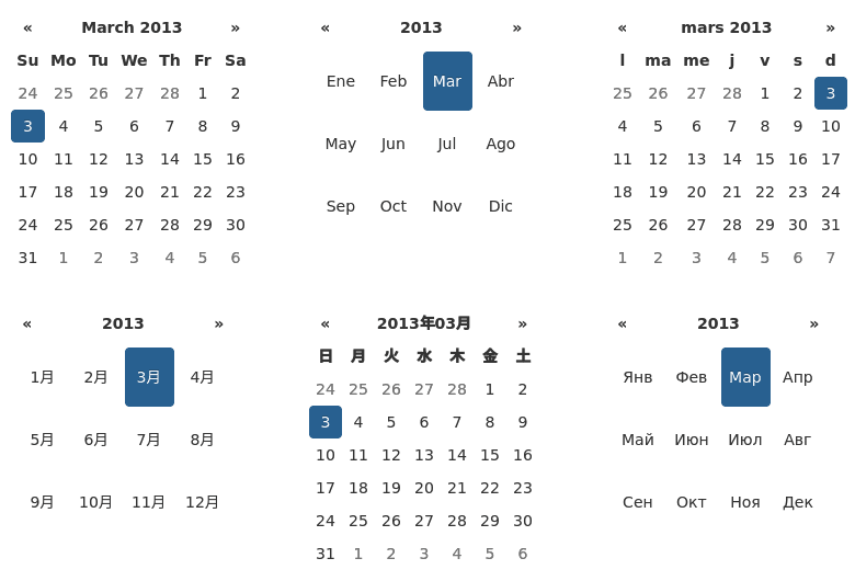
Bootstrap-date picker provides a flexible datepicker widget in the Bootstrap style. This library is old enough, but still popular and tested. It is suitable for those who use legacy code. The library still supports Bootstrap 2 and 3. Localization is well-developed, and there is also support for RTL languages.
Built-in customization is well-developed. There are many methods, options, and events you can use to make the tools you need.
jQuery Datepicker
Pickadate.js
GitHub stars: 7.7k
Price and License: MIT License
Website/Demo: https://amsul.ca/pickadate.js/
GitHub: https://github.com/amsul/pickadate.js
Type: calendar
Localization: custom solutions (more than 40 languages, including RTL)
Accessibility: Keyboard, touch
Type of installation: bower
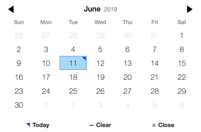
This jQuery datepicker is designed to be mobile-friendly and fully responsive, so it’s a great solution for all devices.
Pickadate runs on jQuery, so you do need that library as a dependency. However, this file is pretty lightweight, and it doesn’t take much to get it working so even with jQuery you shouldn’t notice any page lags.
Pickdate offers both date and time selection menus, so it’s a fully-featured option no matter what data you’re collecting.
This project has very convenient shortcut buttons. For example, a button that allows you to choose a present day. These little things affect product perception a lot.
The library comes with translations for over 40 languages. It also has touch & keyboard friendliness. Pickdate follows BEM style class naming and utilizes LESS-based stylesheets. It supports all modern browsers, including IE8+.
Daterangepicker
GitHub stars: 10.4k
Price and License: MIT License
Website/Demo: http://www.daterangepicker.com/
GitHub: https://github.com/dangrossman/daterangepicker
Type: text-input, calendar
Localization: moment.js
Accessibility: Keyboard, touch
Type of installation: include a link to a webpage

This project will be very useful if you have a website for providing rental housing, cars, or anything else. The design is very well-made and discreet. Installation is done by simply copying a piece of code into your page. It supports multi-month pickers.
Another Daterangepicker advantage is the configuration generator. You can choose the options that you need via an interface and it will give you the code you can paste into your page. In addition, quite extensive documentation will help with the development and customization of the plugin.
Datetimepicker by xdan
GitHub stars: 3.4k
Price and License: MIT License, up to $15 per license
Website/Demo: https://xdsoft.net/jqplugins/datetimepicker/
Github: https://github.com/xdan/datetimepicker
Type: calendar
Localization: a custom solution
Accessibility: –
Type of installation: include a link to a webpage
Another jQuery project. A fairly simple library with advanced functionality on a paid basis. This product offers many different formats for date & time selection and requires just a single line of JS code to operate. It offers sidebar time selection along with the date selection at the same time.
Multi-framework Datepickers
Syncfusion React Datepicker
GitHub stars: –
Price and License: MIT License, up to $15 per license
Website/Demo: https://www.syncfusion.com/react-ui-components/react-datepicker
Github: –
Type: calendar date-picker
Localization: –
Accessibility: –
Type of installation: –
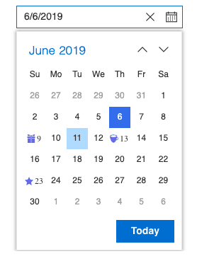
Syncfusion DatePicker is a lightweight, mobile-friendly component that allows end-users to enter or select a date value. There are month, year, and decade view options to quickly navigate to the desired date. It supports minimum dates, maximum dates, and disabled dates to restrict the date selection.
The plugin comes as part of a large product that includes various UI components for web development in popular frameworks.
Apart from the standard built-in theme, DatePicker provides complete control over the component appearance to customize the style for your application.
React DatePicker controls are also available in Angular, Vue, and Blazor frameworks that are built from their own TypeScript libraries.
You can control all the UI elements and components’ behavior with a rich set of developer-friendly APIs so you can provide the best experience to your end-users.
Flatpickr
GitHub stars: 13.1k
Price and License: MIT License
Website/Demo: https://flatpickr.js.org/
GitHub: https://github.com/flatpickr/flatpickr
Type: calendar date-picker
Localization: i10n
Accessibility: –
Type of installation: npm
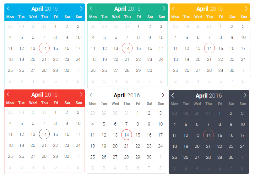
The lightweight Flatpickr plugin is easy to use and even easier to set up. It’s designed with simplicity in mind: the default UI will fit into any layout.
With Flatpickr, you can customize the initial date, month, and year along with restrictions on which date(s) can be picked.
While developing this date picker, its author kept in mind these principles:
“Almost every large SPA or project involves date and time input. Browser’s native implementations of those are inconsistent and limited in functionality. Most other libraries require you to pull in heavy dependencies like jQuery, Bootstrap, and moment.js. I wanted something good-looking out of the box, dependency-free, powerful, and extensible.”
The product provides the following features:
- Dependency-free (no bloated bundles).
- Date + time input.
- Range selections.
- Ability to select multiple dates.
- Easily disabling specific dates, date ranges, or any date using arbitrary logic.
- 50 locales.
- 8 colorful themes (incl. dark and material).
- Libraries are available for React, Angular, Vue, Ember, and more.
No doubt this is one of the best date picker plugins considering its design, UX, and features.
Principles of designing/developing custom datepicker
What can be difficult about developing a decent datepicker? We just need an input field where we need to enter dates and then a pop-up calendar. But any datepicker won’t fit into every interface, and not every product even needs a datepicker.
Therefore, we need to make sure the datepicker works well, does not irritate the user, and is pleasing to the eye. To do this, we need to ask some questions about the goals of the user and also know some of the design principles of the datepicker.
Let’s look at these questions as well as sample answers
What should a date picker be used for?
“I want to reserve a hotel to stay during vacations”
Do you need to pick a date or a range?
“A range. Something like a 5-day range, or 2 weeks.”
For the range picker, are there any frequently used ranges?
“I often need 3 days. A week would be good also.”
Is it the date picker only, or picking the time should also be available?
“No. I only need dates.”
Will the date picker be mostly used on the web or mobile?
“Both”
Do you need to choose dates that go far back in time?
“No, I don’t need this feature”
What is wrong with your current experience in this part of the product?
“I often click the wrong dates and wrong range ”
Datepicker Design Principles
- Provide a list of applicable dates for a limited number of date options.
- Do not require users to enter special characters to format dates.
- Report errors appropriately.
- Remove illogical date options.
- Preserve users’ work.
- Keep date ranges consistent.
- If your site caters to international users, your date format should be clear and understandable.
Recap and conclusion
Looking back now, what can we do with a datepicker? You can combine day, month, and year into one input field and add a fancy calendar icon. We can also use smart inputs, mini-steppers, and flexible dates, and we can allow users to switch between week and month views or change the level of fidelity of the calendar accordingly.
I hope these datepicker plugins will be valuable for web designers and developers.
BONUS: Perfect Date and Time Picker Checklist
We got this checklist from our colleagues at Smashing Magazine.
If you’re about to design a datepicker, here are all of the questions you might have to ask yourself to choose the right solution for your problem:
General Questions
- Decide whether you are designing a date picker, a date-range picker, or a time picker.
- Is the flow between input fields and calendar overlay seamless, with the next step triggered automatically?
- Is the date picker the right pattern to use for date selection in the first place? Would it be faster to have predefined options such as radio buttons instead, a slider, a native OS date picker, or a conversational interface?
- How do we avoid displaying unavailable dates or zero-results dead ends?
- Consider localization techniques; for example, a mix of a “month” drop-down and manual date input for month and year for birthdays.
Input Field Design
- If the date is likely to be quite far in the past or the future (for example, when booking a vacation), a numerical input with a datepicker might be a good option. If the data input range is usually quite short (less than six weeks, such as when booking a medical appointment), definitely consider adding a mini-stepper for quicker jumps.
- Should the user be able to type in a date in the input field or only select predefined values using a calendar overlay?
- With numerical input, is inline validation robust and reliable enough for various separators and ill-formatted inputs? Is it also keyboard-accessible?
- Do we allow for “smart” date input? For instance, do we accept “three days ago,” “yesterday,” “next week” or “in July” as an input?
- Should the date-picker contain preselected default values? If yes, then what values will be the default?
- Do we keep the expected date format suggestion (placeholder) when the user activates the input field?
- Persist the data after a page refresh, and add a “Reset” link to enable the user to cancel their input easily or not.
- Do we add mini-stepper navigation for quick jumps between days, months, or years — right in the input field and in the calendar overlay?
Calendar Overlay Design
Ideally, providing numerical input, a calendar overlay, and a mini-stepper seems to be a safe bet, as long as numerical input is reliable enough.
Ideally, any date selection should be achieved within at most three taps.
- Should the date-picker overlay appear when the user clicks on the input or with a click on the calendar icon (or both)?
- How many weeks, months, or days would you display in a given view?
- How do we incorporate any localization techniques? For example, should the week run from Monday to Sunday or from Sunday to Saturday?
- How do we indicate the current day and time in the calendar overlay?
- Should we include some sort of “previous, current, next” mini-stepper for quicker navigation?
- Figure out the critical details that’s important to your customers and expose them prominently. It could be availability, pricing, or public holidays. Use colored dots or background color-coding for different options.
- Did you make sure that the date-picker disappears when the user clicks outside the date-picker overlay? Do you have a “close” button as well?
- Is it possible to escape to the numerical data input field?
- Should the user be able to clear the selection with a “Reset selection” button?
Daterange picker design
Ideally, any date-range selection should be achieved within at most six taps.
- Is the selected range visualized immediately by connecting the dates in the calendar with a background color change?
- Is the range announced by the screen reader as well when a selection is made?
- Have we considered the design of the “flexible dates” picker?
- Do we use keyboard shortcuts for faster navigation between days, months or years?
Time-picker design
- The simplest option is to combine a vertical slider for days, with a horizontally laid out data list of time slots.
- What’s more useful: asking for the time slot first, or for the date first? Time selection can act as a filter to remove all unavailable days.
- Consider adding the most frequently used timeframes and suggest quick shortcuts to the most common selections.
- And that’s a wrap! Perhaps you had very different experiences than the ones mentioned in the article?
If you have another component in mind that you’d love to have covered, let us know — we’ll see what we can do!
Create React/Vue/Angular app with date picker in minutes with Flatlogic
At Flatlogic, we have built a development platform that simplifies the creation of web applications. The tool allows you to create the React/Vue/Angular/Node.js/Laravel app in minutes with tables, forms, and other components, you just need to choose the stack, design and define the database model with help of an online interface and that is all. Preview generated code, push it to your GitHub repo and get the generated REST API docs.
See the quick guide below on how to build a full-stack web app with the help of Flatlogic.
Step №1. Choose your project name
Any good story starts with a title, any good React App starts with a name. So, summon all of your wit and creativity and write your project’s name into the fill-in bar in Flatlogic’s Full Stack Web App Platform.

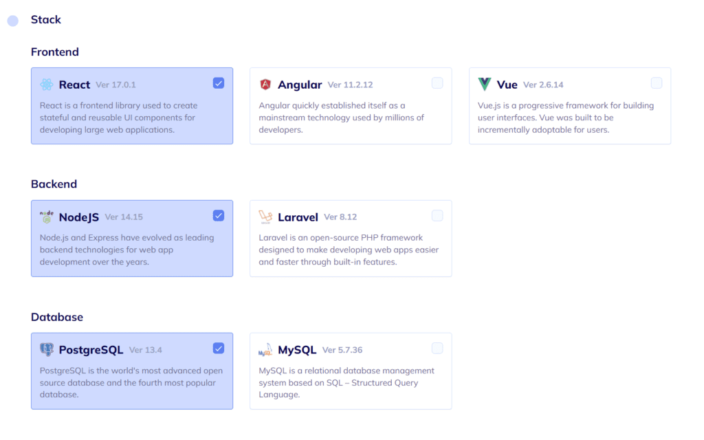
Step №2. Select your Web App Stack
In this step, you will need to choose the frontend, backend, and database stack of your app. And, to correlate with our illustrative React App, we will choose here React for the frontend, Node.js for the back-end, and MySQL for the database.
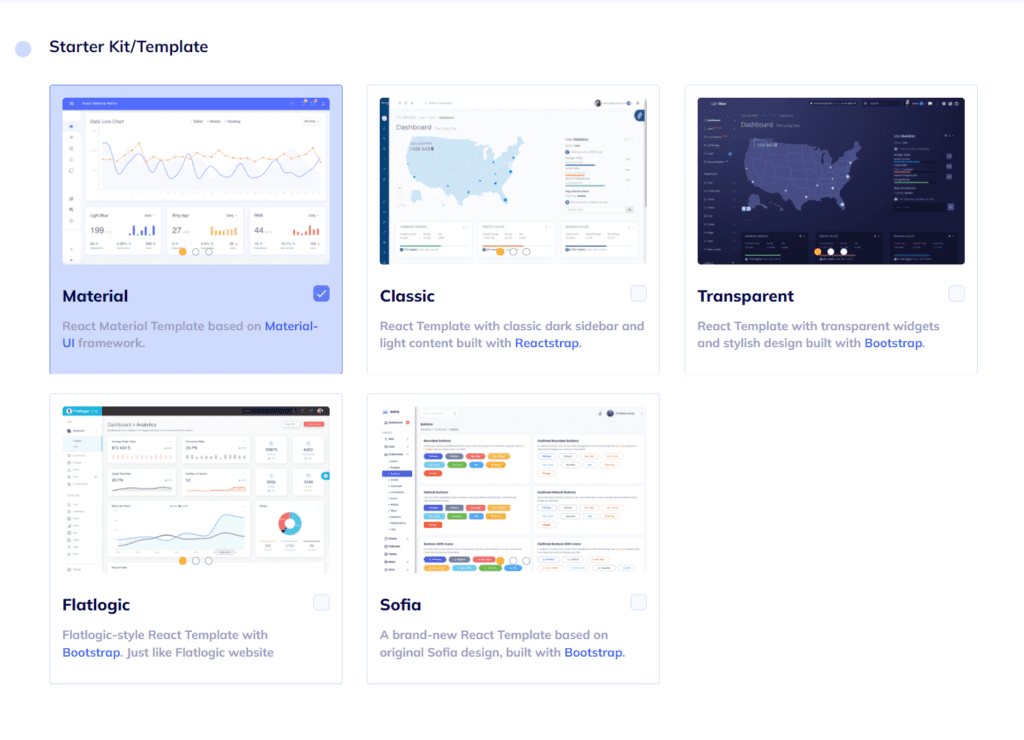
Step №3. Choose your Web App Design
As we’ve already mentioned, design is important. Choose any from a number of colorful, visually pleasing, and, most importantly, extremely convenient designs Flatlogic’s Full Stack Web App Platform offers.
Step №4. Create your Web App Database Schema
You can create a database model with a UI editor. There are options to create custom tables, columns, and relationships between them. So basically, you can create any type of content. Moreover, you will receive automatically generated REST API docs for your application.
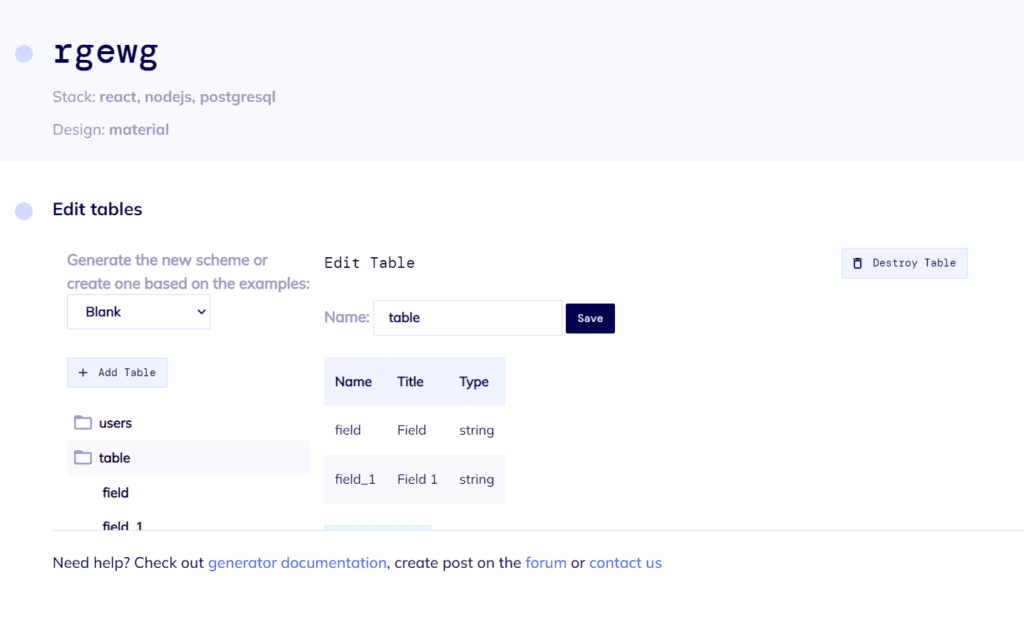
Step №5. Review and Generate your Web App
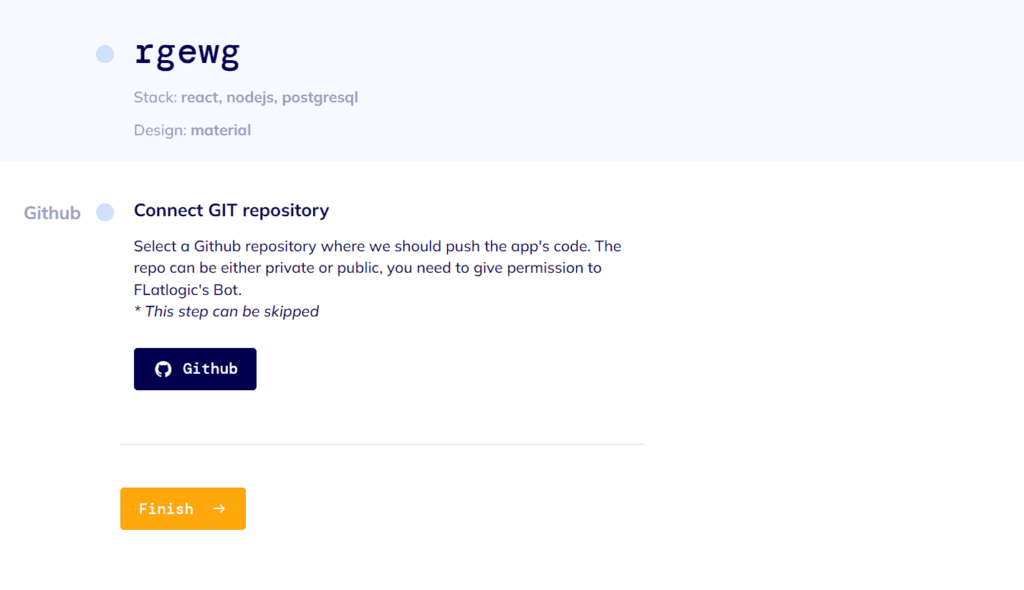
In the final step, just to make sure everything is as you want it to be, you can review all of the previously made decisions and click the “Create Project” button. After a short time to generate, you will have at your fingertips a beautiful and fully functional React/Vue/Angular Node.js App. Voila! Nice and easy!
We will be helpful if you support us on Twitter (if it’s still alive), LinkedIn, Facebook, and ProductHunt!
About our company
At Flatlogic we develop React, Angular and Vue templates and give our most professional clients a special tool to generate CRUD applications by themself and save over 250 hours of the development lifecycle. During the last 7 years, we have successfully completed more than 40 big projects for startups and large enterprises. As a team, we always have a deep desire to help our clients. We are listed among the Top 20 Web Development companies from Lithuania. Fill out the form on the right corner of the main page and feel free to ask!
