The most evident outcome of the digital revolution (or the third industrial revolution) that began in the latter half of the 20th century is the amount of data that is collected and analyzed every day.
In 2016 the global IP traffic first exceeded one zettabyte (a zettabyte is equivalent to 1021 bytes). The common amount of digital data in the world was more than 1 zettabyte as far back as in 2012. According to Cisco research it’s expected 4.8 zettabytes of traffic per year by 2022. These numbers impress.
That data includes videos, pictures, tweets, emails, messages. Besides, web apps collect data about users, websites collect cookies, marketing needs to understand the preferences and behavior of thousands of users, businesses require numbers to develop a strategy and move forward.
And what to do with that all collected information? Show it…But how?
The world came up with several ways of representing the data: tables, charts, and graphs. Whether you need to organize, analyze, identify a trend, track the changes over time, you can use all tools above.
Do you like this article?
You might want to read:
Bootstrap Tables Guide and Examples
Representing your data in the form of charts is a great way to convey information to users. But the visualization of charts must be beautiful and insightful to users. The modern design of apps has gone far beyond the standard flat visualization that was a decade ago. The main requirement has stayed the same: charts must be informative. However, chart forms and types vary a lot, so you have control over user experience via the design you chose – and you are expected to make a good decision about the way you represent the data, otherwise, you shouldn’t wait for a high number of users.

Charts are the most common data visualization components of mobile and web applications. One of the advantages of JavaScript frameworks like React is that it offers scalable and versatile components. React is a great framework that lets developers build rich and high-quality user interfaces easily, so your users will love to use the app.
In the article, we discuss what types of charts exist, how users can interact with charts, what functional opportunities every type of chart offers, define the criteria for picking the right chart, and look through the list of the best React charts examples and libraries.
Charts types and their features that may be useful
Let’s start with a review of the most popular and well-known chart types.
Pie chart
Possible functions
- Droll-down – an option when the individual slices can be clicked to expose more detailed data. The slice can be drilled down to the next sub-category of data.
- Drill-up – give an option to return to the previous upper-level of the data.
- Select slice – all slices have no selection by default. This option allows the user to click on the slice and select it (if there is no drill-down opportunity) by moving it apart from other slices or using special animation like a blackout of other slices.
- Select multiple slices – selection of multiple slices. An additional useful option here is summing data attached to the slices.
When to use
- When you need to show relative proportions or percentages of a whole dataset.
- When you want to show the general sense of the part-to-whole relationship in the data without the precise comparison of separate slices.
When not to use
- When you need to compare data in different slices across pies.
Line chart
Possible features
- Scroll back (time) – change the displayed period to earlier without changing the period size.
- Scroll forward (time) – change the displayed period to later without changing the period size.
- Change time unit of measurement – choose different time aggregation units (year, day, hour, etc.)
- Select a point – if you want to see the detailed information of a certain point on a line, you can click on it or just move the cursor over it.
- Multi-axis – allows configuring the chart for multiple Y-axes, each associated with one or more data series. It’s useful when you need to track the dynamic in different interrelated continuous values that have different units of measurement or range.
- Zoom in / zoom out – an option to interact with an x-axis and change the size of the period for a chart. It allows viewing for a large period. The data on the line chart modify according to the selected period.
When to use
- To visualize trends in continuous data that change over some time.
- If you want to display multiple series of data for the same timeline and see the difference in their dynamics.
When not to use
- If the data contains different categories and their all must be displayed.
Bar chart
Possible features
- Pick variation of bar chart – charts can be oriented vertically (categories on X-axis) or horizontally (categories on Y-axis). If we face long categories labels (like the sample above) it is a good idea to use a horizontal bar chart.
- Select a label – when clicking or hovering the label it reveals detailed information about the values for the label.
- Multiple select – click on labels to select multiple labels. If selection also sums up the values of every label – it’s great.
- Change / cancel selection – edit or cancel the selected period.
- Positive and negative variations – a chart with positive values that are above a mid-point (zero, by default) and negative values that are below the mid-point. They are most often painted with contrasting colors.
- Scroll left or right / top or down – if a chart is inscribed in the frame, this option allows to look through all labels.
- Zoom in / zoom out – an option to fine-tune chart appearance by changing its Y-axis dimension and number of labels at one frame.
When to use
- If you want to make a comparison of metric values across different subgroups of your data (in other words, if you work with categories).
- When you want to show the changes over time in a dataset.
- Stacked bar charts are helpful when you want to see the relationship of every stacked sub-bars on the total amount and track their changes over time.
When not to use
- If you have multiple data series that are independent and are not parts of the whole.
- When categories have different measurement units.
Area chart
Possible features
- Select a point – by clicking on a certain point within a chart, you can see the precise values of all categories at this point.
- Scroll – change the display period to earlier / later.
- Zoom in / out – an option to make the period on the chart smaller / bigger.
- Positive and negative values – when a chart allows to display negative values (only uses for non-stacked area charts) under X-axis.
When to use
- This area chart gives you a quick comparison of the trend for several series over the time
- When you need to see the magnitude of the trend for all series.
- When there is a lot of points on the X-axis
When not to use
- When you have a lot of categories to compare with insignificant variations in values between them.
- When you need a precise comparison of values for categories.
Composed (combined) chart
In most cases, composed charts are a combination of a bar chart and line charts.
Possible features
- Select a slice – an option to select a certain point and see all values from all types of charts at that particular point.
When to use
- If you need to compare values with different measurement units.
- If the values are different in range.
When not to use
- If the number of graph types you want to display is more than 3. It’s better not to mess up the information and make several graphs.
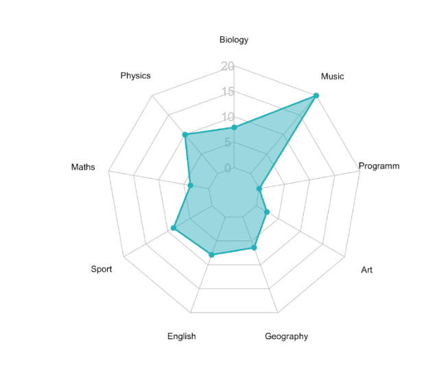
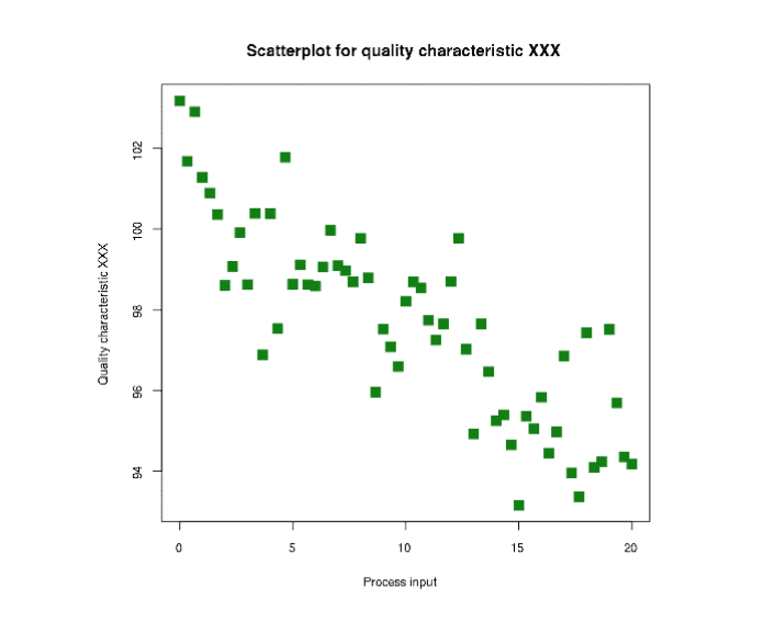
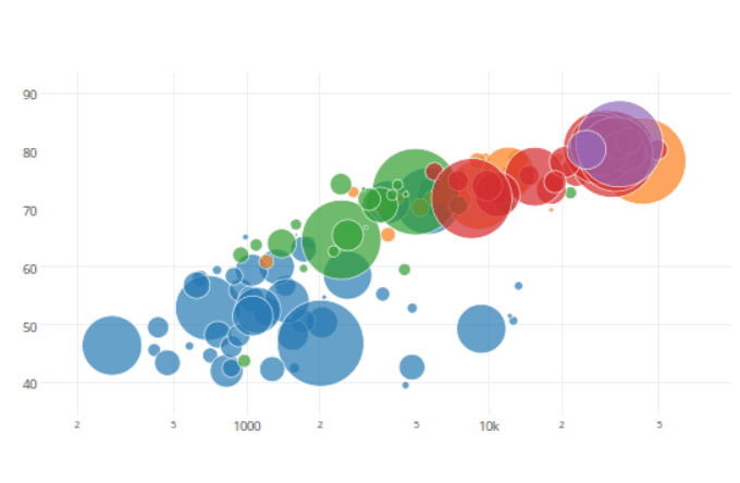
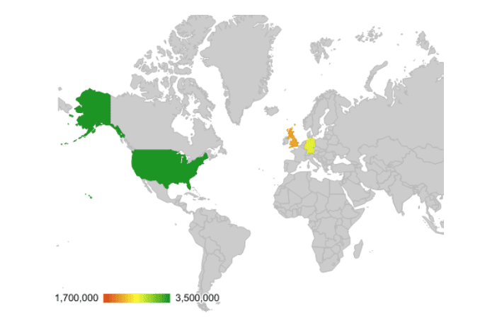
Other charts
There are tons of different charts people have invented. We list some of them without a detailed review.
Radar (polar) chart
Source: https://www.datanovia.com/en/blog/beautiful-radar-chart-in-r-using-fmsb-and-ggplot-packages/
Scatter chart
Bubble chart
Geo chart
Source: https://support.google.com/docs/answer/9143071?hl=en
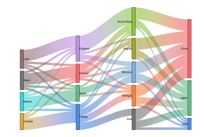
Sankey diagram
Source: https://www.originlab.com/doc/Origin-Help/Sankey-Diagram
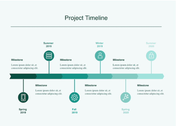
Timeline chart
Source: https://cacoo.com/templates/project-timeline-template
And that is not an exhaustive list of possible chart types. Developers, managers, and analytics all over the world adjust graphs to their needs. Charts become more tailored to the area where they are applied, however, almost all charts can be constructed out of charts listed above. For example, a stock chart that displays the exchange rates of currencies is a line chart with several series. A Gantt chart that is used for project management is based on a horizontal bar chart. If you want to get to know about most of the existing charts (44 charts to be exact!), read this article.
Among specific features we would like to list some additional features that are common for all types of charts and may be necessary for some applications:
- Animation – smooth and seamless animation provides a more consistent and nice user experience and increases the chances that users would like to work with your app.
- Additional events for interaction with a chart – charts may provide an option to attach custom events to any rendered element. When users trigger the event (on click, on touch for mobile, for example), some rendered elements can be modified, altered, or complimented.
- Chart export – an option to save the chart in a local file (pdf, jpeg, png).
How to choose the right chart library?
When it comes to choosing the right chart library first of all you need to define the type of React chart your app needs. We have mentioned some common pieces of advice when to use different chart types, however, we covered not a comprehensive list, and maybe some tailored charts would cover your needs much better, than classic pie, bar charts. The decision on which chart to work with must be based on the kind of analysis you are targeting to provide. Another basis for making a decision is the way you want to represent the data to users. We highly recommend to read about existing types of charts here and match your needs with the tasks every chart solves.
If you already know what kind of graph you need, we gathered some factors you should pay attention to while choosing the chart library. The list:
- How many stars on Github a library has? It is popular among developers? Do they trust the chart and use it in their apps?
- Is a Dev activity active or not? Is a library well maintained with regular bug fixes, new features deployment, and issues solving?
- What kind of support from developers is available?
- Does the chart provide mobile support? Is chart responsive out of the box? Does it support touches and gestures?
- Is the library well-documented with examples and explanations of every feature it offers?
- Does a chart offer additional features that you can use to make the user experience of working with charts much better?
- Does the chart have some nice-looking themes out of the box? Does the library allow to customize the design of a chart? What kind of customization does it offer?
- Do you need SVG or Canvas output? SVG is great for a small or medium amount of dataset, while Canvas shows better performance when working with a large database.
Additionally, it’s worth mentioning two things that were not included in the criteria, but which you need to know before you go looking for an ideal chart for you.
Most libraries are client-side rendering, while server-side rendering charts are exceptions. If it is not a problem and you are not looking for a server-side rendering library, we keep going.
Another thing you need to know: most of the libraries depend on d3.js. D3 is a popular JavaScript library with 90 k stars on GitHub for visualizing data using Canvas, SVG, and Html. It’s a library with huge Dev activity, plenty of videos, tutorials, books, etc. It stems from a low-level approach and gives the developers freedom to create their own charts. For what is this information?
If you are good at D3 or have an intention to level up in it, you should consider an option to write your own charts library. It may become a very good solution if you want to make a solution special for your use case.
Top React Charts
We start from the most popular charts libraries for React. You can find a lot of chart types in every library, so you can look through them first. The top itself is divided into several abstracts by the chart types.
Most popular charts libraries:
- Pie charts
- Line charts
- Bar charts
- Area charts
- Composed charts
- Gantt charts
- Other libraries that are worth to mention
A brief list of the most popular charts libraries:
- Recharts is a charting library built on React components with 16 k on GitHub. It doesn’t offer a great variety of chart types, however, it contains main chart types like pie, bar, line charts which are highly customizable and go with a lot of well-tested features.
- Victory is a collection of components for charting and data visualization with 8.8k on GitHub. It contains 25 types of charts that you can easily customize and integrate with your app. The options to fine-tune the design are also great. If the amount of charts in Recharts library doesn’t satisfy you, visit the website of this library.
- Nivo is a popular React charts library with full components for data visualization. It offers more than 50 types of charts with comprehensive documentation for every type. The number of stars on GitHub is 8.5 k.
- Visx is a set of low-level visualization primitives for React from Airbnb company with 13k on GitHub. If you find all three previous libraries not suited for your use-case, go to Visx and built your own React chart using well-tested primitives that Airbnb offers.
Best pie charts examples
Pies from visx
That pie is built from a set of low-level primitives that visx library provides. It features a modern design and ample opportunities for customization for every element.
Rating: 13k stars on GitHub
Dev activity: a huge amount of developers like this library. The last update was in the February 2021
Support: yes, on GitHub
Mobile support: not out of the box, but you can use the chapter to make the graph responsive
Documentation: there is the documentation for every primitive, code sample and live demo for every chart, and getting-started tutorial for beginners
Additional features:
- it’s possible to create your own pie chart using primitives a library offers,
- the design uses gradient out of the box,
- the chart is interactive.
Customization options: the library itself is all about customization
Drawing options: SVG
A pie chart from nivo
Rating: 8.5k stars on GitHub
Dev activity: yes, a community with more than 1 k participants on discord channel
Support: yes, issues page on GitHub
Mobile support: a mobile-friendly chart
Documentation: exhaustive documentation with guides, theming section, FAQ, live examples, component playground
Additional features:
- animated motions and transitions from react-motion,
- there is a server-side rendering option,
- event handler.
Customization options: it is a highly customizable chart with an online sandbox where you can change the visual appearance of the chart with the user interface
Drawing options: SVG, Canvas
A pie chart from react-chart.js
A nice-looking well-coded pie chart with a transparent design and simple interface without redundant functions. The chart is a part of the react-char.js library. It is a wrapper for HTML5-based library chart.js with 53 k on GitHub.
Rating: 3.8k stars on GitHub
Dev activity: there is a huge community for the chart.js library you can get in touch with, the last update of react-chart.js was at the end of 2020
Support: yes, via issues page on GitHub
Mobile support: the chart adjusts to all screen resolutions
Documentation: the wrapper itself contains several lines of code that are described on the GitHub page. The original charts library is well-documented
Additional features:
- you can exclude data series from the chart with a nice animation,
- click events.
Customization options: limited customization options
Drawing options: Canva
Best Line charts examples
Line chart from Recharts
Recharts is the most popular React charting library with simple and clean fully responsive charts. Line chart from that library offers a lot of customizable options to make a chart special for your app.
Rating: 16.1 stars on GitHub
Dev activity: a huge and active community, the library constantly gets updated
Support: quick support via GitHub (almost 2k issues were closed)
Mobile support: fully responsive, support mobile gestures
Documentation: great documentation for every option the chart offers
Additional features:
- connects two points between which there is an empty value,
- padding options,
- you can add a reference line,
- customizable dots,
- synchronized brushing.
Customization options: labels of line, area, bar, axis, the shape of a bar, the content, and other elements can be customized.
Drawing options: SVG, Canvas
Line race chart from Echarts for React
That chart goes with the Echarts library. It is a React wrapper for Apache Echart, an open-sourced JavaScript visualization tool with 45k stars on GitHub.
Rating: 3.1 stars on GitHub
Dev activity: a huge and active community with more than 350 opened issues, the library gets updates and bug fixes constantly. The last was in February 2021
Support: qualified and vivid support via issues page on GitHub (only 5 opened tickets)
Mobile support: the chart itself is responsive, however, it doesn’t look great on small screen resolutions
Documentation: well-structured code with a live example
Additional features:
- VML rendering (for earlier IE versions),
- server-side rendering chart,
- dynamic animated changes of the chart when the data is altered,
- export is available.
Customization options: dark/lite mode, decal pattern, and a separate page with customization options for every element
Drawing options: SVG, Canvas, VML
Line chart from FusionCharts
A simple line chart that goes in FusionCharts library along with other types of charts. The charts library has an integration with different technologies and frameworks, including the most popular frameworks for frontend development: Vue, Angular, React.
Rating: 74 stars on GitHub
Dev activity: there were several frequent releases with bug fixes, but the last update was at the beginning of 2020
Support: support only via issues page on GitHub
Mobile support: yes
Documentation: comprehensive documentation with examples
Additional features: an option to hide/show series by clicking its name in the legend, export option, export options
Customization options: 4 design themes out of the box
Drawing options: Canvas
Best bar charts examples
Bar chart from Recharts
That is a well-coded bar chart library that comes with a bunch of chart forms for all possible needs: simple, stacked, mixed, with custom shapes, with positive and negative values.
Rating: 16.1 stars on GitHub
Dev activity: a great number of developers contributing to the continual development of the library, the updates are frequent
Support: quick support via GitHub issues page
Mobile support: mobile-friendly, handles mobile gestures
Documentation: great documentation for every option the chart offers
Additional features:
- customizable events,
- option to set a bar chart min-height,
- a positive and negative stacked bar chart form,
- multi-axes.
Customization options: the whole chart is highly customizable. You can look through all options here
Drawing options: SVG, Canvas
React Material Admin Full
These charts are a part of a premium template with a clean material design
Rating: 1k stars on GitHub for a limited free version of the template
Dev activity: the last update was in February 2021, the Dev activity is big since the template is one of the products from the Flatlogic team of developers
Support: good full support via forum/email
Mobile support: yes, fully responsive. Click the name on mobile to hide its series on the chart
Documentation: well-structured code, the documentation minimalistic
Additional features:
- nice and smooth animation,
- the template allows downloading charts as SVG, PNG, and CSV files,
- it highlights series when you hover the appropriate name in the legend,
- you can use a bar with an image in the background.
Customization options: easy customization, quick start, 3 inbuilt design themes
Drawing options: SVG, Canvas
Bar chart with slider from Victory
It is a responsive charting component for React that features a connected slider that allows to choose the period (years in the example) to display.
Rating: 8.8 stars on GitHub
Dev activity: the library is actively developed, there is a channel for developers where you can discuss any issues
Support: great support from the Formidable team
Mobile support: fully responsive chart
Documentation: docs with guide, FAQ, configuration documentation, and live code examples
Additional features:
- a flexible events system,
- animation and transitions are available,
- you can add a background for labels and various label placement options.
Customization options: you can create your own theme with props and specialized styles. There is a list of Victory themes that are available out of the box here
Drawing options: SVG
Best area chart examples
Gradient stacked area chart from Echars for react
A beautiful and interactive area chart with an awesome gradient-based design.
Rating: 3.1 stars on GitHub
Dev activity: a huge and active community with more than 350 opened issues, the library gets updates and bug fixes constantly. The last was in February 2021
Support: qualified and vivid support via issues page on GitHub (only 5 opened tickets)
Mobile support: the chart is responsive, but it is hard to work with it on mobile
Documentation: well-structured code, API references, there is a Chinese version of the documentation and the example goes with Chinese sample data
Additional features:
- VML rendering (for earlier IE versions),
- server-side rendering chart,
- dynamic animated changes of the chart when the data is altered,
- export is available.
Customization options: dark/lite mode, decal pattern, and a separate page with customization options for every element https://echarts.apache.org/en/option.html#title
Drawing options: SVG, Canvas, VML
Stacked area chart from React-ApexCharts
A great example of an interactive area chart that goes with an open-source tool React-ApexCharts. It is a wrapper for the very popular JavaScript charting library ApexCharts with more than 10 k stars on GitHub.
Rating: 688 stars on GitHub
Dev activity: there are some articles on the internet and a lot of issues on GitHub. The original charts library gets updates constantly, the last update for wrapper was more than a year ago
Support: mail support, GitHub page with tickets (two pages, one for wrapper and another for the original library)
Mobile support: the chart adjusts to mobile screen resolutions, but doesn’t handle gestures like swipe left/right
Documentation: the library comes with documentation for all chart essentials, like animations, events, tooltip, grid, legend, live demos for the chart, and descriptions of all methods
Additional features:
- gradients,
- a user control panel,
- update from json API and ajax,
- hide/show series on the chart,
- export option.
Customization options: there are 11 color palette out of the box, monochrome and background images options
Drawing options: SVG
Best composed charts examples
Plots from React-Vis
This chart is a good product from Uber company. Despite this is a complex chart, it requires a minimum amount of code and sensible defaults which means that your chart looks good even if you don’t do anything.
Rating: 7,7k stars on GitHub
Dev activity: last the last update was in 2019
Support: rare support via GitHub issues page
Mobile support: fully responsive, support clicks
Documentation: documentation, storybook, live examples, and API references – all that you can find on the official website
Additional features:
- powered by react-motion animated library ,
- support positive and negative values.
Customization options: you can customize every aspect of the chart via the React-Vis style sheet and properties or using your own style sheet
Drawing options: SVG, Canvas
A composed chart from Sing App React
A composed chart with modern design from a great designer. The chart is a part of the premium Sing App React dashboard template. The chart allows to display area and line charts.
Rating: 1.2k stars on GitHub
Dev activity: the last update was in March 2021, the developers are very active
Support: yes, there is a special support forum
Mobile support: the chart is responsive across all devices, but the interactions on mobile are not very convenient
Documentation: great documentation with a live demo of the chart
Additional features:
- neat animation when hovering any series,
- an option to hide/show series on the chart by clicking on its name in the legend.
Customization options: basic customization options
Drawing options: Canvas
Best Gantt React charts
Gantt chart from React google charts
React Google Charts is a wrapper for React that allows using charts developed by Google.
Rating: 950 stars on GitHub
Dev activity: the last update was in 2018, the community is active because new issues are appearing
Support: the support is very poor via the issues page on GitHub
Mobile support: yes, but the responsive Gantt chart is hard to read on mobiles
Documentation: excellent documentation with examples and detailed configuration options
Additional features:
- shows the percent done for every stage when hover it,
- allows to set the chart-specific events.
Customization options: two design themes (dark and default), a lot of configuration options for data, arrows, rows.
Drawing options: SVG
JavaScript/HTML5 Gantt chart for React
This Gantt chart is a very complex chart with all possible functions and options for this type of chart. That is a full-fledged framework for your app. It has free and paid licenses.
Rating: 655 stars on GitHub
Dev activity: the last update was in February 2021, there is a community forum with more than 2,5 k topics about the Gantt chart (and even more about other products)
Support: technical and community support
Mobile support: yes
Documentation: a step-by-step guide, API references, comprehensive documentation
Additional features:
- auto-scheduling,
- dynamic loading,
- task grouping,
- event handlers,
- and much more.
Customization options: fully customizable, you can customize time scale, define grid structure, style taskbars, and more
Drawing options: Canvas
Other libraries that worth mentioning
Rough Charts
Well-documented charts with a hand-drawn style.
BizCharts
A data visualization library from Alibaba, a technology company that specializes in e-commerce, retail, Internet, and technology. The library is great, however, all demos and documentation are available only in the Chinese language.
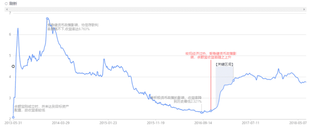
React time series charts
A charting library for visualization of time series data and network traffic.
React stockcharts
An opinionated chart dedicated to finance. The library uses several indicators like EMA, SMA out of the box.
That’s all. We hope that you have found a chart for your app.
Thanks for reading.

