Using Modal and Card Components
Using CardBoxModal Component
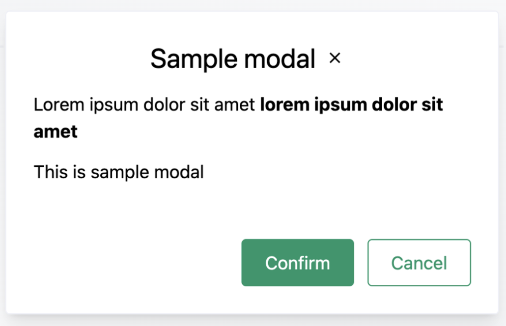
The CardBoxModal widget is a customizable modal component that allows the display of content within a dialog box on your application. This component is designed to be flexible, supporting various content types and button configurations. You can locate the CardBoxModal component within the frontend/src/components directory of your project.
Usage Example
Below is an example showcasing how to import and use the CardBoxModal component in your React application.
import CardBoxModal from '../components/CardBoxModal';

function ExampleComponent() {
    const [isModalActive, setModalActive] = useState(false);

    const handleConfirm = () => {
        // Logic for Confirm action
        setModalActive(false);
    };

    const handleCancel = () => {
        // Logic for Cancel action
        setModalActive(false);
    };

    return (
        <CardBoxModal
          title='Sample modal'
          buttonColor='success'
          buttonLabel='Confirm'
          isActive={isModalActive}
          onConfirm={handleConfirm}
          onCancel={handleCancel}
        >
            <p>
              Lorem ipsum dolor sit amet <b>lorem ipsum dolor sit amet</b>
            </p>
            <p>This is a sample modal</p>
        </CardBoxModal>
    );
}
Component Properties
-
title: This property sets the text displayed as the modal's header. buttonColor: Specifies the style of the buttons within the modal. The available styles are defined in theColorButtonKeytype, located infrontend/src/interfaces/index.ts. Here is a list of valid options:export type ColorButtonKey = | 'white' | 'whiteDark' | 'lightDark' | 'contrast' | 'success' | 'danger' | 'warning' | 'info' | 'void';
buttonLabel: The text label on the confirmation button.isActive: A Boolean flag that controls the visibility of theCardBoxModal. Whentrue, the modal is displayed.onConfirm: A handler function that is called when the user clicks the confirm button.onCancel: A handler function that is invoked when the user clicks the cancel or close buttons
Example:

Using CardBox Component
The CardBox component is designed to be a versatile container with optional enhancements like hover effects and customized internal layouts. It is located within the frontend/src/components directory of your project.
Usage Example
Here is an example demonstrating how to use the CardBox component, showcasing its customization options and layout possibilities.
Example:
import CardBox from '../components/CardBox';

function ExampleCard() {
    return (
        <CardBox className='rounded' isHoverable hasComponentLayout>
            <div className='px-4 py-6 flex divide-x-2'>
                <div className='px-3'>
                    <p className='text-xs text-gray-500'>Account</p>
                    <p>Account Name</p>
                </div>

                <div className='px-3'>
                    <p className='text-xs text-gray-500'>Rating</p>
                    <p>71932.34</p>
                </div>
            </div>
        </CardBox>
    );
}
Result:
Component Properties
-
className: This property allows you to apply additional CSS classes directly to theCardBoxfor styling purposes. -
isHoverable: When settrue, this property makes theCardBoxhighlight when hovered over with a mouse. -
hasComponentLayout: This boolean property indicates whether the content passed in thechildrenprop has its styling. IfhasComponentLayoutis false, theCardBoxwill apply default padding to the content.
Sub-components
The CardBox component also includes several sub-components that provide standardized styles and padding. These can be used to maintain consistency across different parts of your application that use the CardBox. The subcomponents include:
-
CardBoxComponentBody: Used for the main content of the card. -
CardBoxComponentEmpty: Utilized when there is no content to display, showing a default empty state. -
CardBoxComponentFooter: Designed for footer content, often used for actions related to the card. -
CardBoxComponentTitle: Provides a styled title area for theCardBox.
These subcomponents are located within the same directory and can be imported and used as needed to build a CardBox with a standard layout.